

Emart App Case Study
The product
Our grocery shopping app will let the users to buy low price fresh products easily and quickly which will affect busy users by allowing them to easily choose products, buy and receive delivery. We will measure effectiveness by analyzing the time spent by the user on the purchase. Our target audience is local community.
Project duration
From April 2022 to June 2023
The problem: Mongolian grocery stores usually don’t have a mobile app. Web pages of grocery stores are complicated to use and order.
The goal: Our grocery shopping app will let users to buy low price fresh products easily and quickly.
My role: General UX/UI Designer. User research, Wireframing, Prototyping, Designing High fidelity product.
User research
Summary
During UX research I used primary and quantitative research method including 12 people. I asked them general questions about their grocery store ordering and pick-up experience through Google form. Most of users choose pick-up and they don’t use grocery store’s web.
Pain points
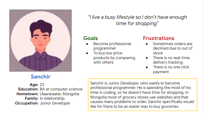
- Fruits and vegetables are often not fresh when buying through online.
- It takes too much time shopping in person.
- Sometimes orders are declined due to out of stock.
- There is no real-time delivery tracking.
Persona: Sanchir
Problem statement: Sanchir is a busy junior developer who needs to buy low price products easily and quickly because he doesn’t have enough time for shopping
User story: Sanchir
As a busy junior developer, who haven’t enough time for shopping, Sanchir wants to use an app with real-time delivery tracking, so that he can use an app to place orders while he is “on the go” and pick up the order at home
Big picture storyboard: Sanchir
Scenario: Use the Emart grocery shopping app to quickly and easily order low price fresh products
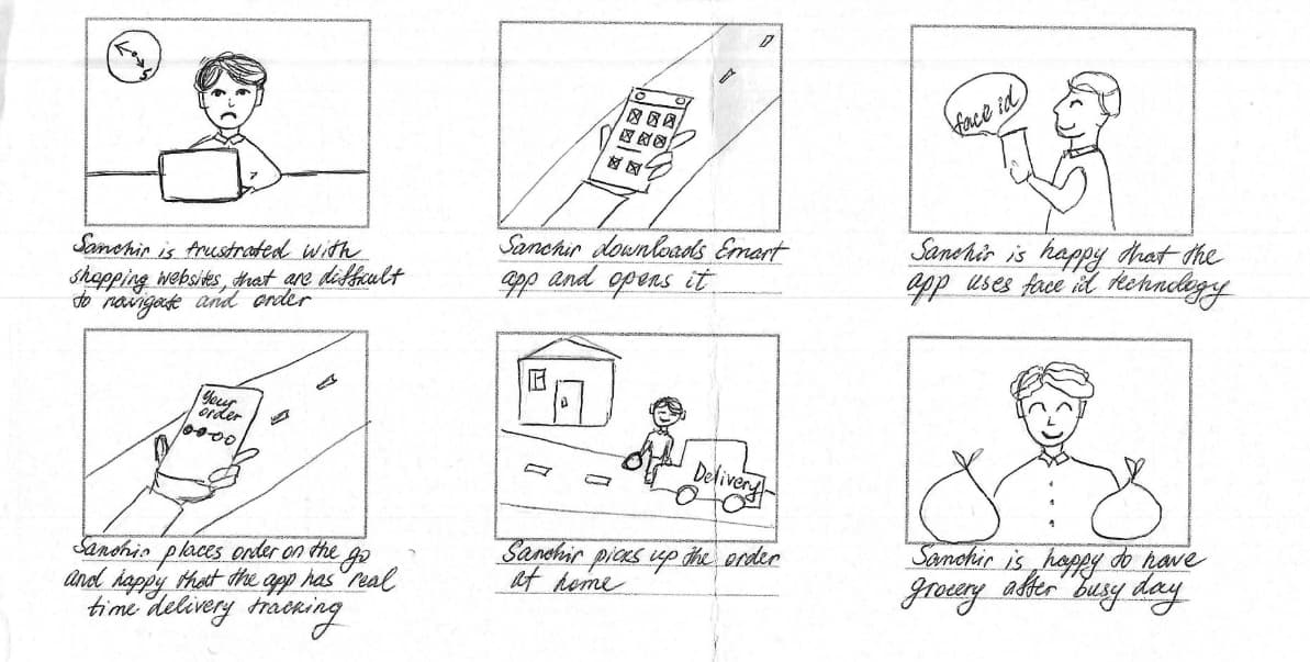
Close up storyboard: Sanchir
Scenario: Use the Emart grocery shopping app to quickly and easily order low price fresh products
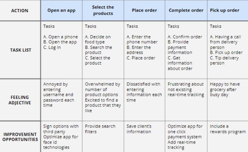
User journey map
Persona: Sanchir. Goal: an easy and quick way to buy grocery.
Starting the design
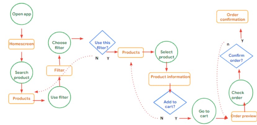
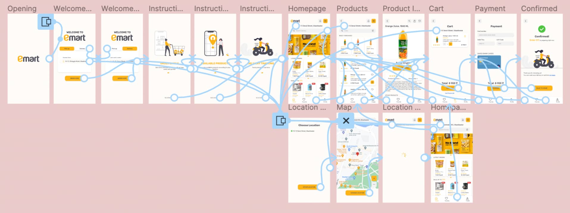
User flow
User task: Use the grocery shopping app to place order quickly and easily.
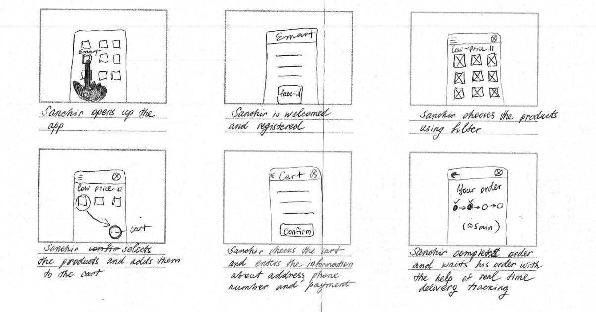
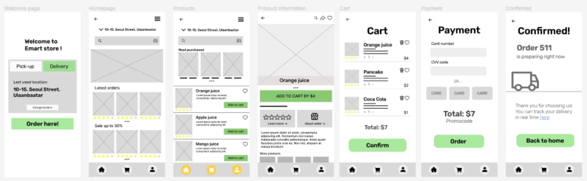
Paper wireframes
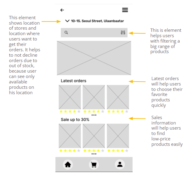
Before drawing wireframe, I decided to include in my paper wireframe: searching area, cart icon, menu, account icon, home icon, images about products and filter to help users find low-price products easily.

Digital wireframes
Here is my first homepage wireframe for Emart grocery shopping app.
Low-fidelity prototype
This lo-fi prototype shows linear product ordering process: https://www.figma.com/file/tgBja8nt8GjTKiHIl0mN4M/Wireframe-for-food-delivery-app?node-id=0%3A1
Usability study: findings
I conducted two rounds of usability studies. Findings from the first study helped guide the designs from wireframes to mockups. The second study used a high-fidelity prototype and revealed what aspects of the mockups needed refining.
Round 1 findings:
- Users need better cues for what steps are required to find the product
- Users need better cues for what steps are required to order the product
- Users need a more intuitive way to access location changing
Round 2 findings:
- Users need more large typography size on important information
- Users need more easy and clear way to change the location
Refining the design
Mockups
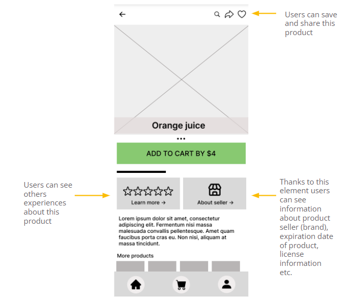
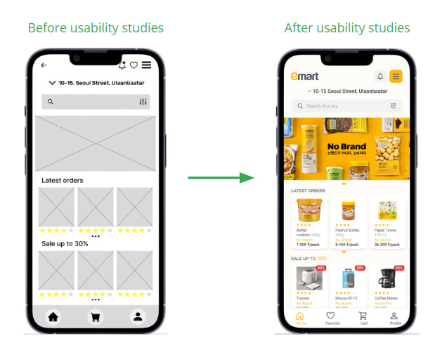
Early design allowed users to navigate, but after the usability studies, I added product name, information, brand and price. I also added favorite items into bottom menu instead of heading.
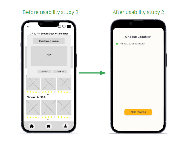
The second usability study revealed frustration with the location changing flow. To streamline the flow, I changed dropdown into pop-up.
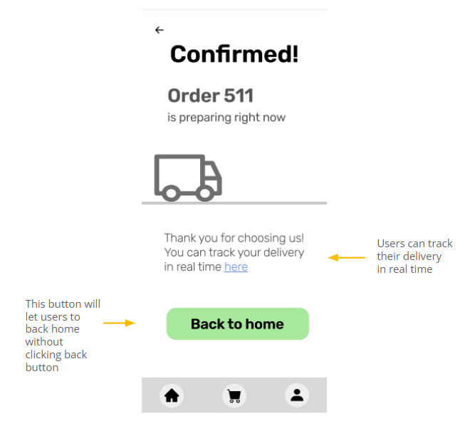
Key mockups
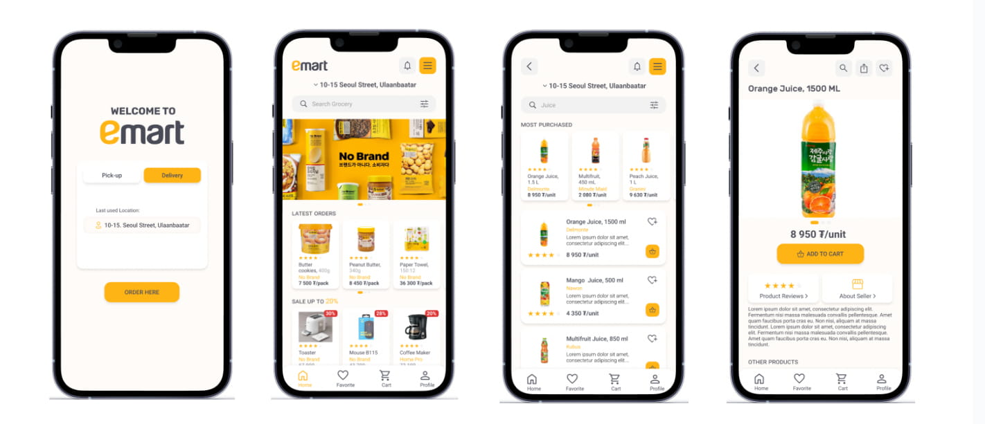
High-fidelity prototype
The final high-fidelity prototype presented cleaner user flows for ordering grocery. It also met user needs for a pickup or delivery option.
View the Emart grocery shopping app High-fidelity prototype
Accessibility considerations
- The app identifies Emart shop branding and uses yellow as the primary colour. All colours used in this app are high-contrast and comply with WCAG lightness ratio requirements.
- The app uses many gestures and motions to make the user experience more convenient. For example, when the user presses a location button to change the location, a pop-up window appears. Also, when the user wants to close it, they can drag it down.
- The app uses material icons, high-quality images and good illustrations to navigate users. They all identify the shop's branding.
Going forward
Takeaways
Impact: (Nathan Montgomery) said "I think your wireframe looks awesome! I wish more buttons worked so I could play with it a bit more. Felt linear, but I loved the buttons and I didn't feel lost in your design."
What I learned: During this project, I learned that design process is not that easy what it looks like. This is my first project, so It was hard to me to empathize with users and see their pain points. At least I did it! I included in my design all solutions that will help to users saving their precious time.
Next steps
- I will deeply learn about Emart mall’s marketing method and will trying to include these in my design
- I will improve payment process in my design and include face id technology
- I will design mobile app for other local grocery stores
Thank you for reading my Emart App case study!
If you have any questions, please feel free to get in touch through u@namiy.dev.